Measuring Emissions
Making supply chain carbon visible - and opening a new market
- Role
- Design Lead
- Team
- ~30 designers, PMs, and engineers across 3 teams
- Timeline
- 12 weeks · Q3 2023
TL;DR
Led 0→1 discovery that became Indigo's primary strategic bet for 2023–2024.
Self-started: defined scope, recruited team, drove research and design end-to-end.
Built the business case for 3.6× ARR growth (seven → eight figures)
Shipped MVP that landed six-figure revenue in the first three months
The problem
Indigo Ag was a late-stage climate tech company helping large food companies decarbonize supply chains. The open question wasn't only product-it was market: is there a new addressable tier below enterprise, and what would it take to reach them?
Most people think carbon means energy: fuels, efficiency. For food companies, ingredients-not factories or trucks-are roughly 70% of total emissions. Nestlé's public footprint breaks it down: Scope 3 ingredient sourcing is 71.4% of the whole. You can't plan reductions without a baseline. The industry had accountability without visibility.

Source: Nestlé climate reporting
“Working on how to get our grocery products to net zero carbon by 2040 - and right now we don't even have a baseline.”
Discovery
The first gate was internal. Before running a single external session, I spent weeks with CPG and supply chain experts already inside Indigo - building vocabulary, stress-testing assumptions, mapping where the industry had tried this and failed. That domain fluency was what made external recruitment possible at all; the subject was specific enough that cold outreach to participants wouldn't have worked.
Once I had a frame, I made the case to the VP of Product, recruited a junior researcher, and stood up the formal discovery project. Third-party recruiters sourced participants we couldn't have reached through our own network.
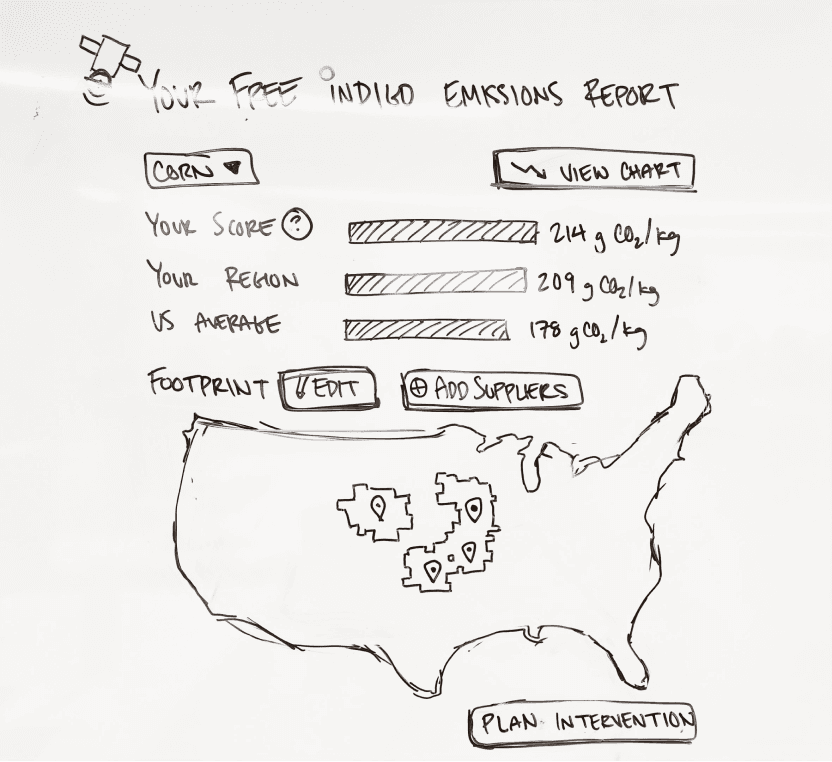
Each session split its time: half structured research guide, half visual reaction to rough sketch concepts. The concepts were conversation starters drawn at a fidelity meant to be thrown away - concrete enough to push back against, not finished enough to defend.
PM and I divided signal ownership: PM owned GTM (what could actually be sold, to whom, in what window); I owned user signal (what jobs the tool needed to do and for whom). We synthesized at the end to scope something both real for users and sellable. The PM carried the project forward from there.
The pivot
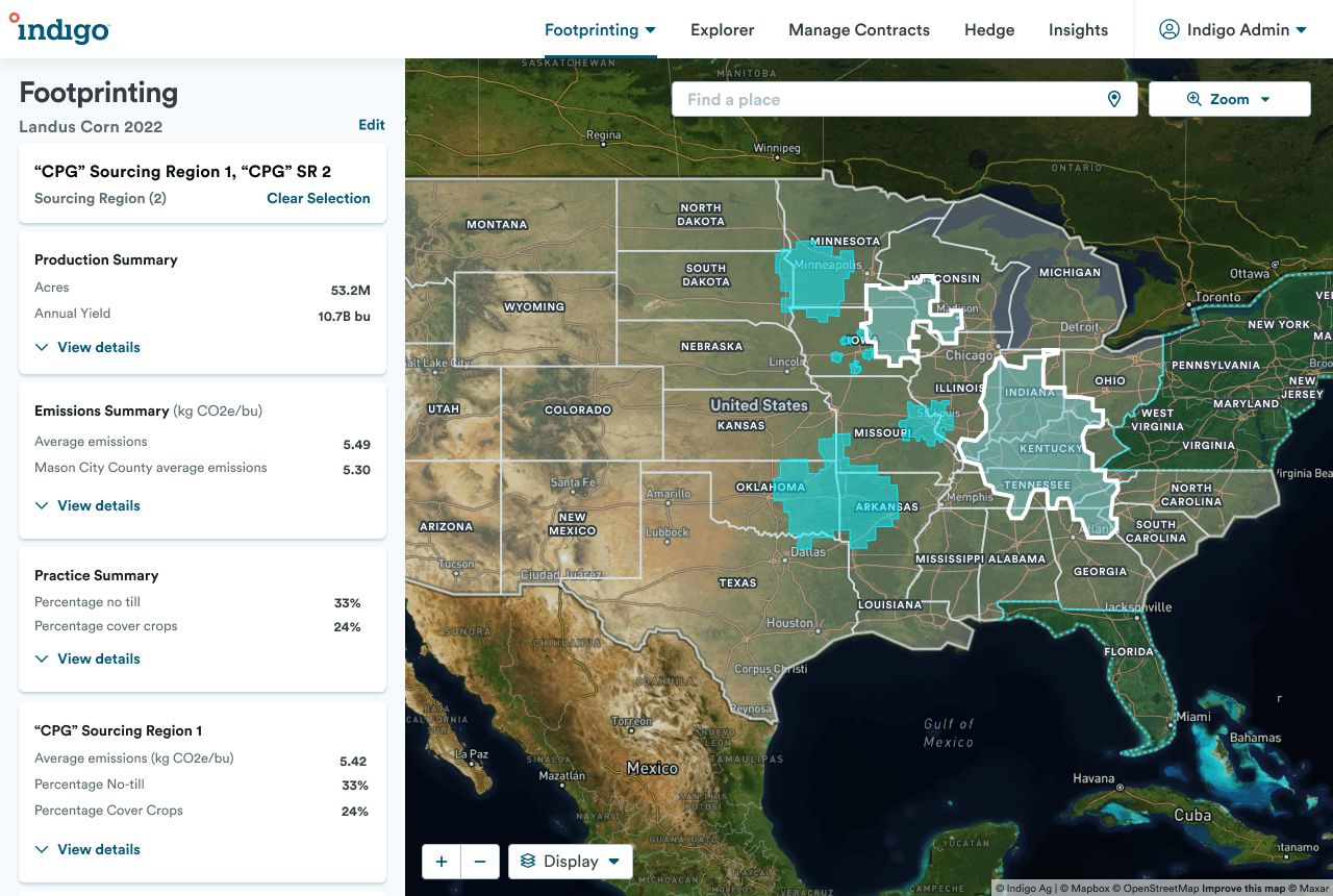
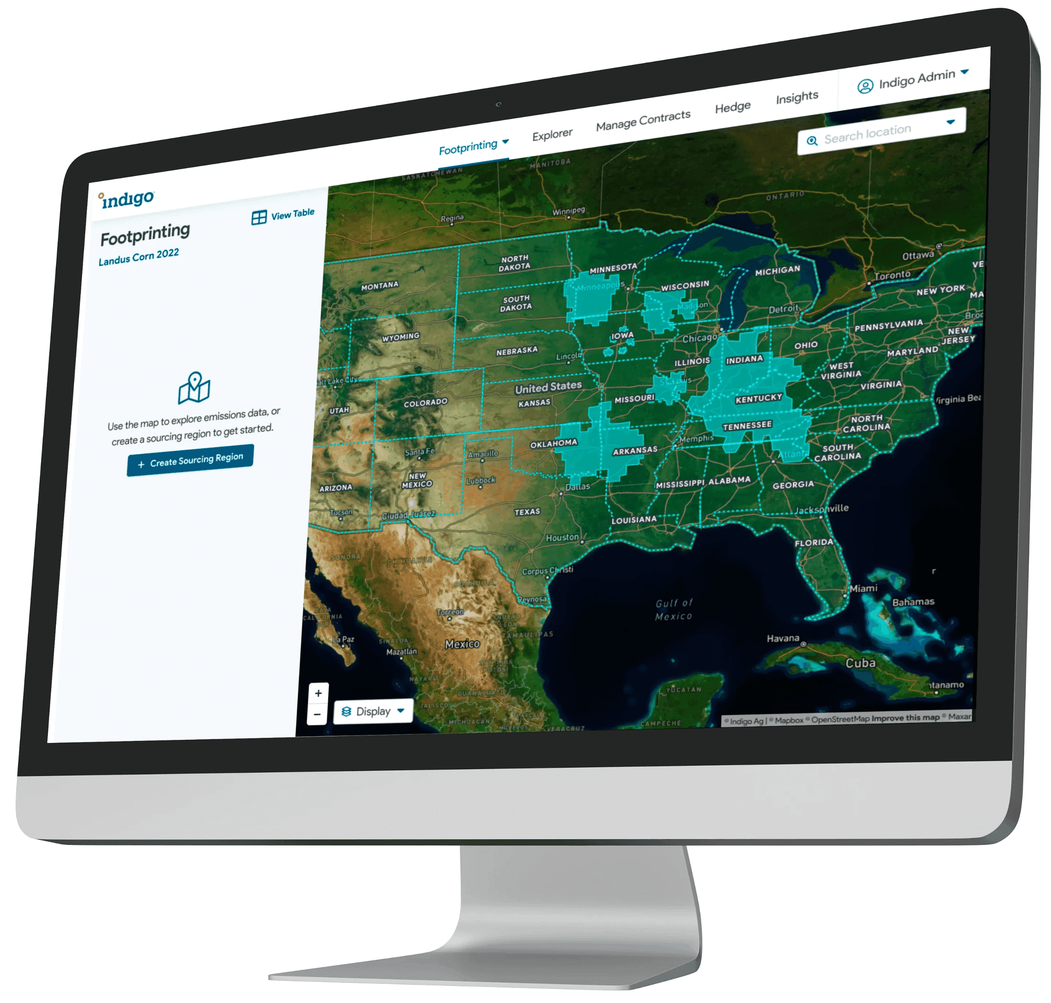
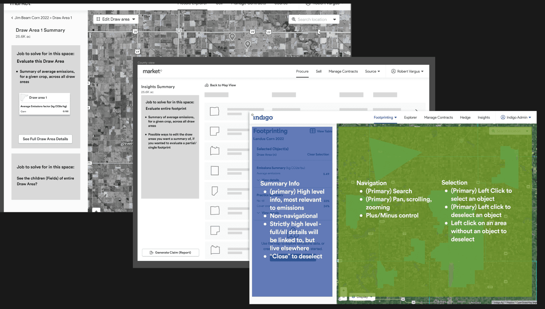
The leading concept was map-based. Emissions tie to geography, and the map resonated early - grain buyers said they'd never had visibility into this aspect of their supply chain before. It also worked in sales conversations as an educational surface: the geography made the carbon story intuitive.
But the two user groups had different relationships to the problem. CPG companies created demand pressure - sustainability commitments were forcing procurement decisions downstream - but they couldn't act directly. Grain aggregators were the actual buyers, and they were excited. That distinction mattered: it meant designing for the grain buyer side was the right investment even though the demand signal came from above.
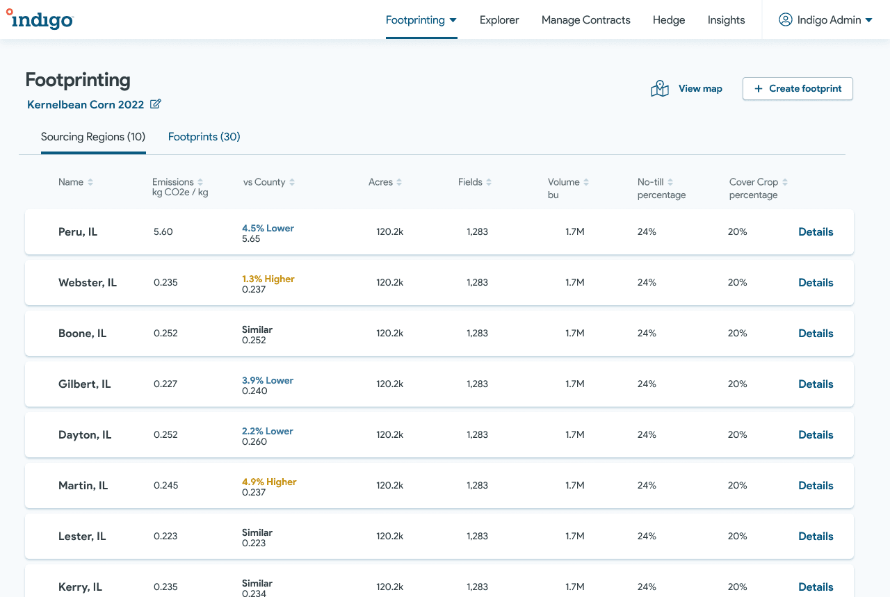
With enterprise food contacts in sessions, pushback on the map was immediate. Those buyers don't think in regions - they think in supplier lists. They source finished ingredients from vendors, not from places on a map. The map was right for education and grain buyers; it was the wrong mental model for enterprises tracking progress toward carbon targets across a supplier portfolio.
We shipped two modes instead of forcing one: a geospatial map for grain buyers and exploration, and a table for enterprises managing large supplier lists. Catching the mismatch at sketch fidelity - before engineering spent a dollar - is what made that possible without a rewrite.
The bigger idea
The product wasn't only measurement-it connected both sides of a market that couldn't transact before. A grain aggregator can see that their corn carries a lower emissions footprint than a competitor's; that signal reaches CPG brands actively sourcing lower-carbon ingredients. Legible data is what opened the tier below classic enterprise deals.
What we built
- A way to define and model a supply chain
- Emissions data aligned with industry expectations for formal crediting
- In-product education on the science so people trust and act on the numbers
Impact
- Built the business case for 3.6× ARR growth (seven → eight figures)
- Six-figure MVP revenue in the first three months
- Became Indigo's primary strategic bet for 2023–2024
- Mapping component work here accelerated later geospatial products
- Still Indigo's core sales tool for the program years later - used to land major food-brand deals long after launch.
Reflection
This was as much market-making as product design. The hardest part wasn't the UI - it was holding a clear strategic frame while scope and stakeholders grew across three teams.